
Here's the principle: We have a box with a one-pixel wide border around it. Inside that box is another box that has a little rounded-corner background image sitting snugly in one of its corners. The inner-box is then nudged out a bit so that it's actually sitting on top of the outer box. If it's all done properly, that little background image can mask the hard right angle of the default border of the outer-box, giving the impression that it actually has a rounded corner.
Take An Image, Finely Chopped
Add A Sprinkle of Markup
<div id="content">
	<p>Lorem ipsum etc. etc. etc.</p>
</div>
Throw In A Dollop of CSS
#content {
	border: 1px solid #c03;
}

#content p {
	background: url(corner.gif) top left no-repeat;
	position: relative;
	left: -1px;
	top: -1px;
	padding: 1em;
	margin: 0;
}
Bubblin’ Hot
- The content div has a one-pixel wide red border around it.
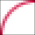
- The paragraph is given a single instance of the background image, created to look like a one-pixel wide arc.
- The paragraph is shunted outside of the box – back one pixel and up one pixel – so that it is sitting over the div’s border. The white area of the image covers up that part of the border’s corner, and the arc meets up with the top and left border.
- Because, in this example, we’re applying a background image to a paragraph, its top margin needs to be zeroed so that it starts at the top of its container.
Et voilà. Bon appétit.
Extra Toppings
- If you want to apply a curve to each one of the corners and you run out of meaningful markup to hook the background images on to, throw some spans or divs in the mix (there’s nothing wrong with this if that’s the effect you truly want – they don’t hurt anybody) or use some nifty DOM Scripting to put the scaffolding in for you.
- Note that if you’ve got more than one of these relative corners, you will need to compensate for the starting position of each box which is nested in an already nudged parent.
- You’re not limited to one pixel wide, rounded corners – the same principles apply to thicker borders, or corners with different shapes.
