Adsense Warfare
Using graphics design to increase earnings
So you’ve got your web site up and running with Google Adsenseadvertisements, but you not getting the click-thru rate you expected?
Well this article hopes to share some of my experiences and other
examples of how to position your forces and strategically draw your web
sites users in and get them clicking that little bit more.
Now I don't
personally claim to be earning huge amounts of money with Adsense but
after integrating the techniques shown below into my sites, my click-thru rates have more than doubled in the past month, therefore I have doubled my Adsense income!
Using Images and Icons
Here
s a great technique for drawing users eyes towards your adverts, it
involves using eye-catching but non-influential images above/below or
to the side of an ad placement. Non-influential
meaning that if you use anything that directly entices users to click
on an advert such as an arrow or flashing text telling people to click
the advertsrt you will get banned from Adsense.
Be careful with this one though as Google's program policies state the following that you "May not place misleading images alongside individual ads"
So in order not to get caught out with this one I would recommend using
subtle images relating to your content or that merge well with your
sites layout.
You can find a great selection of universal
symbols and shapes in Adobe Photoshop using the "Custom Shape Tool".
Below are some subtle examples of how they can be used to make your
adverts stand out that little bit more.
![]()
Integrate them into your navigation
Of
course common sense comes into this one a bit because slapping on
advertisements that look nothing like your sites content with
completely unrelated colours can make them stick out like a sore thumb,
but in a bad way. I guess the true art of integrating them into your
layout designs is to place them near your actual navigation links.
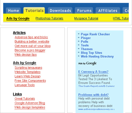
If
you look at the example below, as your eyes pass over the top
navigation you often can’t help but almost click the advertisements
below, I guess this is because they have chosen a colour that both
relates to their colour scheme but one that is slightly more intense
than the navigation itself.
Below also has some great
examples of using a link unit adverts in the same colours as your
navigation, meaning that when users eyes gaze over your content they
may treat these as further content links rather than invading
advertisements.

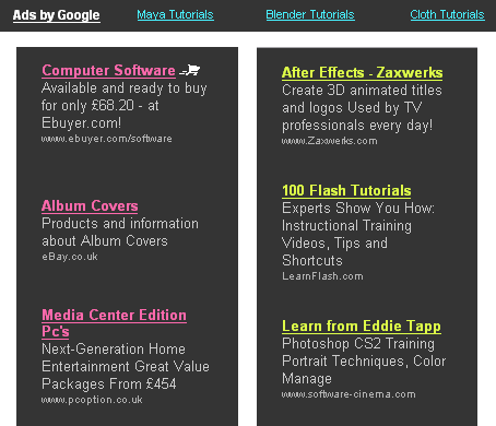
Think Neon
Now
as you might have noticed this web site has some Google adverts of its
own, located at the top and left hand side of the page you can see that
I have chosen a slightly strange combination of colours.
My
reason for adding this kind of effect to my advertisements came when I
visited a random web site a few months back and was instantly attracted
but this bright green text on the right, just as I was about to click
on it I realized “oh this is an ad” then bang it hit me I just had to
do this. A month later I have to say this was one of my best Adsense
moves and has instantly boosted my click-thru rate.

All
I can grasp from this is that users tend to like the use of bright
colours on darker backgrounds, I guess this is common sense to most web
designers, in order to make sure links are always visible, but
obviously some colours like the above seem more visible and enticing
than others.
Do you remember the old "Neon Nerds" sweets
as a kid? With thier bright packing simular to the above, well now I
come to think of it maybe that had the same effect on me and my pocket
money back in the day :) anyway thats all from me ;)
Technorati Tags: Adsense Warfare


