
This article hopes to turn you into a gradient junkie, so its time to
get addicted
Gradients
are like gold when it comes to creating clean, sleek designs,
espesially in this new world of web 2.0 (Oh yes people I used it, and
how you hate me, I understand) but I guess theres no other way to
describe the new use of clean gradient style layouts that are popping
up all over the place. They can be used to create a large impact for
backgrounds or to simply add a subtle touch to a menu or sidebar. This
article hopes to turn you into a gradient junkie, so its time to get
addicted!
Psst, the real secret behind
creating some cool gradient combinations is to only use two or three
colours that are closely related i.e. red -> dark red or red ->
orange. Doing it this way ensures that the colours do not clash and
cause viewers of your artwork to be blinded by some dodgy tic-tac style
colour schemes.
These days I find it hard to think of a
project where I didn't use some form of gradient effect or gradient
mapping technique. Below are a few examples of how they can be used to
great effect in many ways.
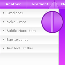
Menus/Sidebars
Just
a simple fade from your background colour to a closely related colour
can really help define elements of your navigation, you can also add
another horizontal gradient effect for each of the menu items in a
vertical menu, but remember the key word for menus keep the colours
subtle as you don't want to blur out the navigation links themselves.
Another
little tip for menu bars is to use a double line to seperate your menu
items, I have mainly used this simple effect on menus but it can be use
to great effect of any kind of coloured/gradient surface. Simply by
using a closely related darker colour for one line and a faded white
for the other, when you zoom out it creates a funky 3D style separation
line that really stands out.
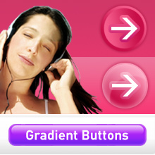
Buttons/Backgrounds
As
mentioned above closely related colours are the key to creating some
wicked gradient effects. Here are some examples of how gradients can be
used for backgrounds to accompany a photograph or to create shiny
buttons that really stand out and give your designs a bit more of a Web
2.0 style. (bam! used it again, you know you love it!)
You can find out how to create these buttons in the "Creating stylish Gradient Buttons" tutorial
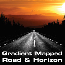
Gradient Mapping
This
is my favourite gradient effect, I often use this tool when creating
themed or vector based graphics as it allows me to overlay a specific
set of colours onto an image or photograph so that they match the rest
of a design theme.
In this example the mapping techniques
used have allowed me to create a themed design that uses only a certain
amount of colours i.e. black white and shades of orange, this was then
incorporated into the rest of the design therefore giving the whole
design its own unique style using only desired colours to match a logo
or brand image.
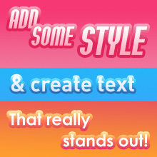
Text Effects with Gradient Overlay
Gradient
can be used to great effect on all font types, simply applying some of
the effect that can be found in Adobe Photoshop's Layers -> Blending
options panel can really bring your artwork to life.
Use
it to make certain text types stand out, it can also be used to give
some meaning or help define different areas of your site for
category/call to action buttons.
View the tutorial "Jazz up text with Gradient Effects" for more.
The
gradient map or gradient overlay tool can also be used to great effect
and really brings some life to any flat two coloured images or text,
check out the example below now how much better does that right one
look? Well there you have it I hope that this article has inspired you
to pick up that gradient tool ever once in awhile and brighten up your
designs, later…
